


Simplifying a Sign-up process
Enhancing User Onboarding
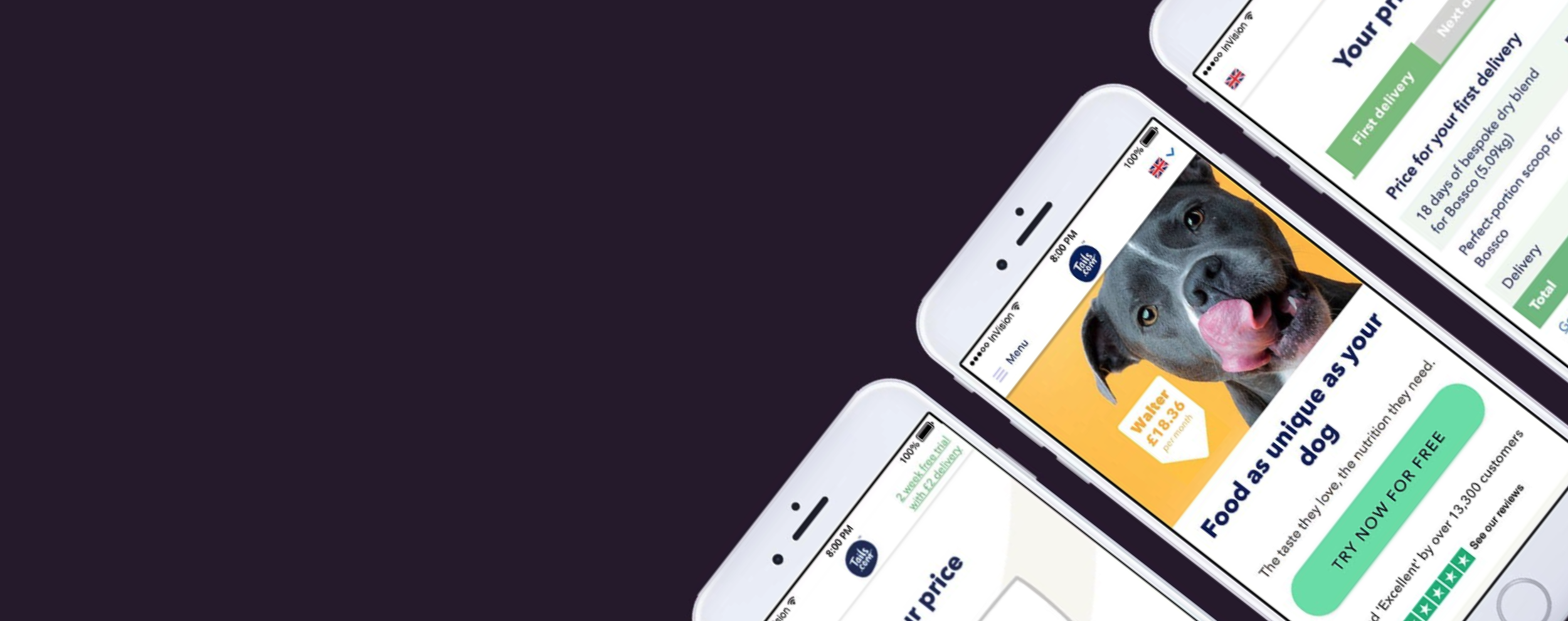
Tails.com lets users create tailor-made dog food, customised for their pet’s needs. Through a networking group I established between Addland and Tails.com, I was invited to help optimise their sign-up process. The goal was simple: make it easier for users to understand, trust, and complete the journey from first visit to subscription, while uncovering key friction points and opportunities for improvement.
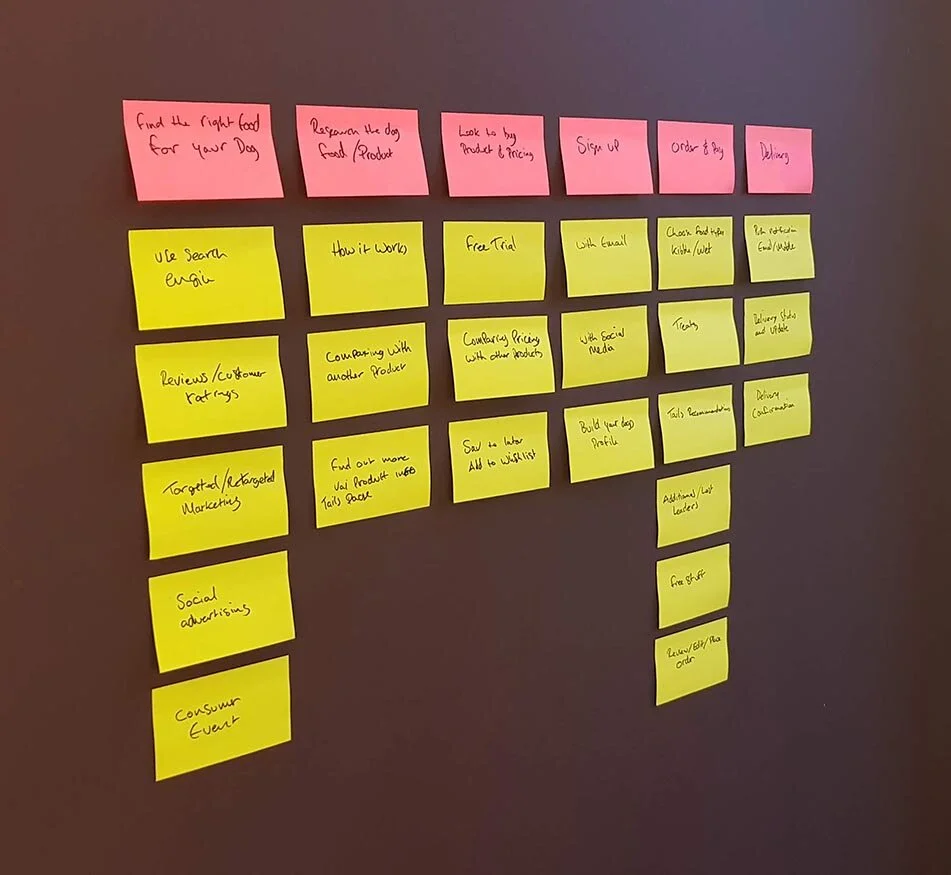
Using basic Story Mapping helps you define and focus on the task in hand, It really helps you to discover the whole story, any sticking points within the journeys and ultimately results in a higher functioning product.
Define the task
Testing the existing sign-up journey
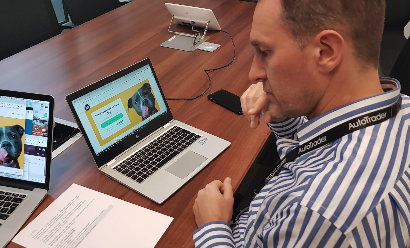
I conducted several guerrilla testing sessions with a broad range of dog owners — some known to me, but most approached at relevant locations and happy to participate.
Testing venues
Coworking office - Dog owners - 8 people
Wags N Tales - Dog Coffee in Surbiton - 8 people
Puppy Training Class - Clapham - 6 people

Understanding your customers
Understanding who you’re testing with is one of the strongest advantages a designer can have. Too often, Product and designers treat this as the responsibility of a User Research team — which is where many products and ideas fall down. During my research and data gathering, I quickly identified what is likely tails.com’s core target audience (orange), alongside a potential growth audience (green).
Hattie (Tech savvy)
Aged 29-55
A busy working professional who prioritises her dog’s wellbeing above her own. She’s happy to spend more on her dog’s food, choosing tailor-made options for their nutritional benefits and reduced risk of allergic reactions.
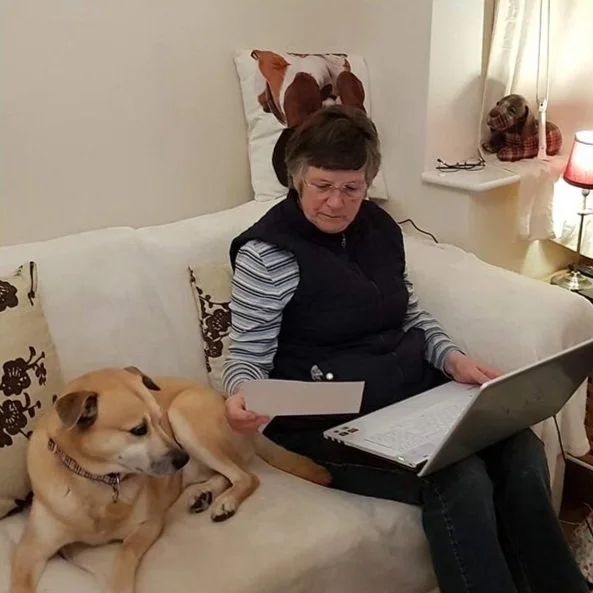
Kathy (uncomfortable online)
Aged 63-75
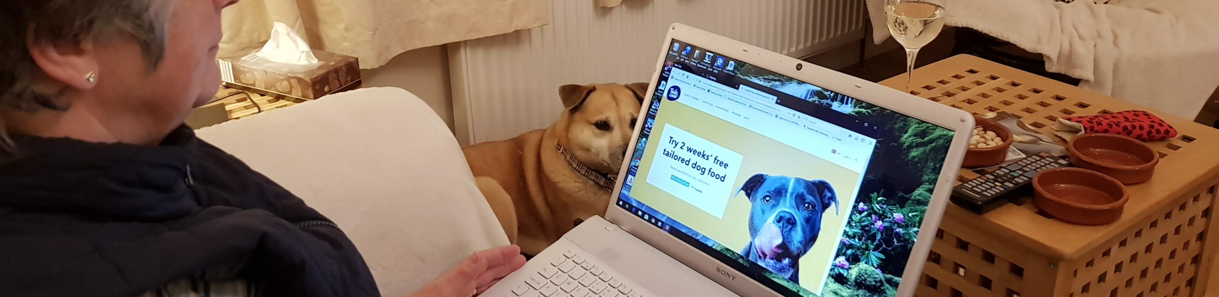
A busy retiree, loves her dog and would see the benefits and convenience tails offer (e.g. not having to lift 15 kg bags of food from Pets At Home). Each of the four people within this age group on which qualitative testing was conducted struggled with the UI when signing up.
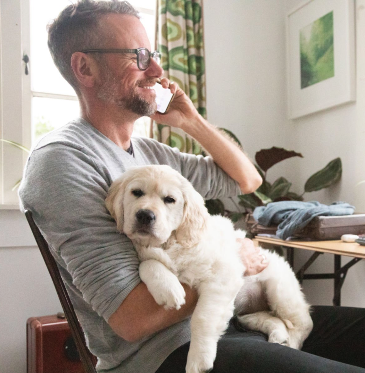
Neil (Tech savvy)
Aged 30-50
He knows that his dog’s health is very important but maybe isn’t being targeted correctly by Tails.com. A key demographic trend I noticed (when examining a cross-section of reviews) is that around 75% of Tails customers were female.
Qualitative testing notes
I created a simple Dog Fooding story to help users understand why they arrived at tails.com and why they were ready to sign up. This also let me validate hypotheses about potential drop-offs and sticking points. After reviewing the testing notes, I developed a variant to use in the next round of tests.
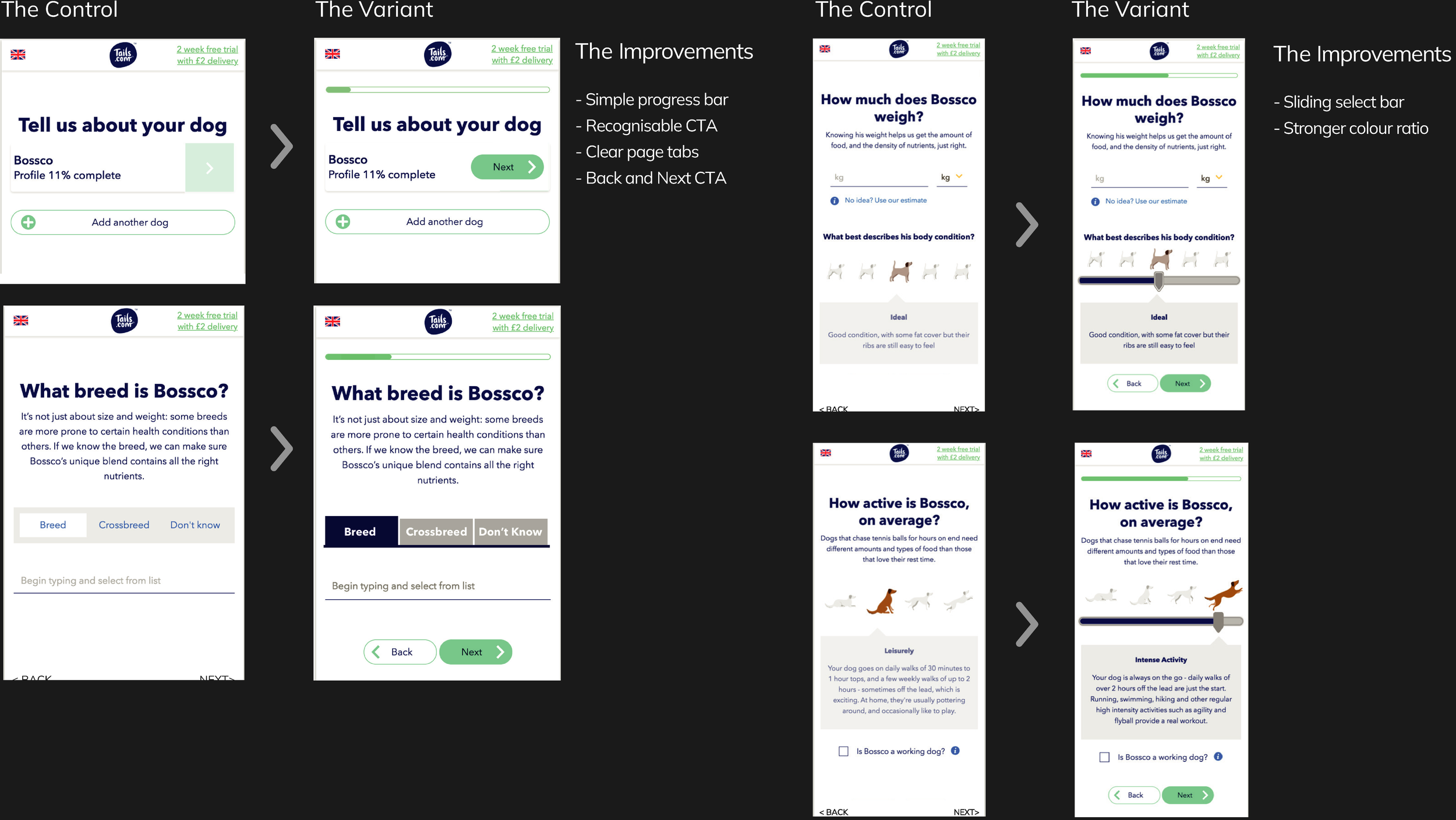
The control and the variant.
The control reflected their existing journey, I didn't want this to be a redesign. I made small, easy to implement improvements: clearer buttons (not hidden or below the fold), a journey progress bar at the top, more prominent tabs, sliders for a known UI/UX, and improved contrast ratios to meet WCAG AA–AAA standards.
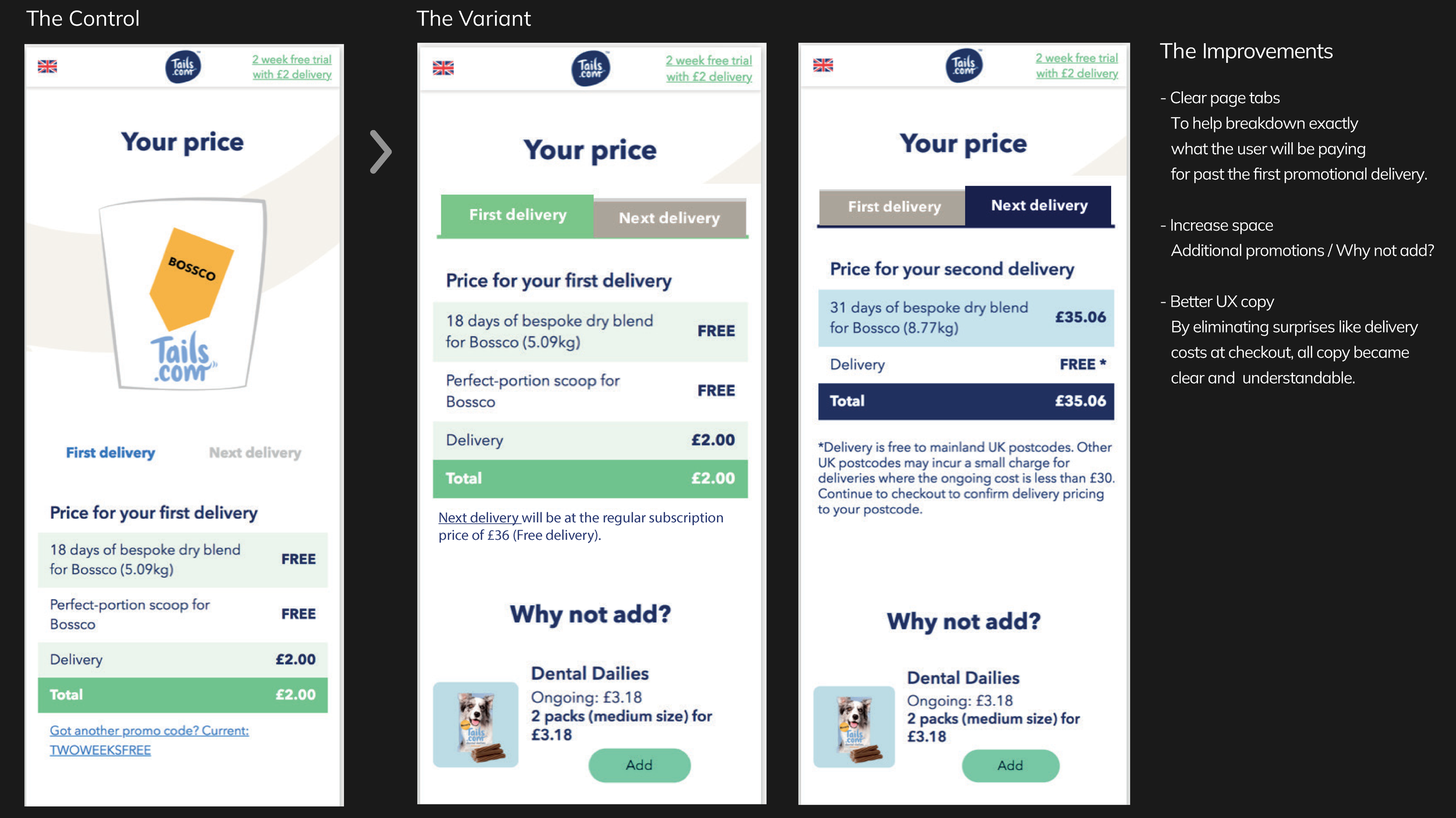
Users also misinterpreted the bag illustration as a receipt, and it occupied around 30% of the screen — space that could be better used. The illustration was moved to the final checkout step.

The Outcomes
Improved clarity and task completion — Users now better understand the ‘Next delivery’ tab, which previously caused the highest drop-off.
Delivered a validated prototype in 4 days, showing an efficient, insight-led process.
Demonstrated adaptable, user-centered design, proving transferable UX and product thinking.
Helped Tails.com better understand core and growth audiences, beyond the signup flow.