



Rebranding a 45 year old
Rebuild, Redefine, Reignite:
A Brand 45 Years in the Making
To help define a distinctive and ownable design language We held a brand personality workshop with members of our Product, Brand and Design teams.
Our teams and board directors collaborated in a brand personality workshop where we crafted the essence and character of our brand. Our approach embodies the essence of "More made easy," while our personality epitomises how we achieve this vision for the future.
Personality statement
“We're pioneering, we build insightful products and services, and we're friendly in our approach - just the sort of expert, impartial help you need when buying or selling a car.”
Over three sprints, we translated key personality traits into visual design, shaping the foundation for our brand elements and actions. We explored colour, typography, imagery, and illustration, validating ideas through external design reviews. As the sprints progressed, we deepened our focus on imagery and graphic assets, refining UI elements and testing design decisions. The final sprint consolidated all learnings, aligning with Auto Trader’s brand explorations and concluding with a clear, validated visual direction.
Design Sprit
The typography choice is bold, friendly & open - helping people to find things easily.Its large x-height aids legibility at small sizes across all audience touch points.
Interesting cuts add enough character to make it ownable without complicating.
Typography
Colours
The colour palette balances Auto Trader’s 45-year heritage with a modern, innovative feel, tailored for digital platforms. We refined tones for consistency across mediums and introduced a secondary, warmer palette to reflect a friendlier personality. All colours meet WCAG 2.0 AA standards, ensuring accessible contrast ratios for both normal and large text.
UI Kit
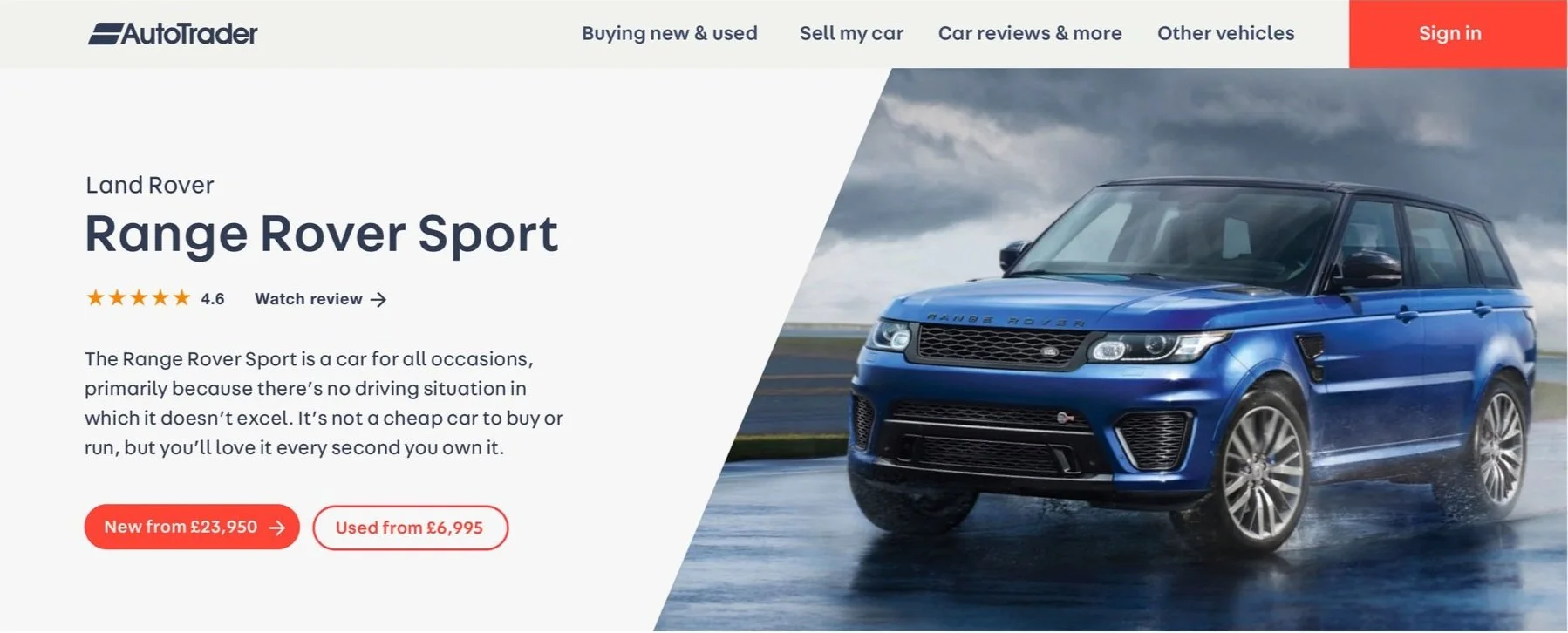
We create clear divisions for content to ensure clarity and ease of use. Cards, buttons, and smaller interface elements use rounded corners to communicate our friendliness and ease of use.
Graphic & Imagery
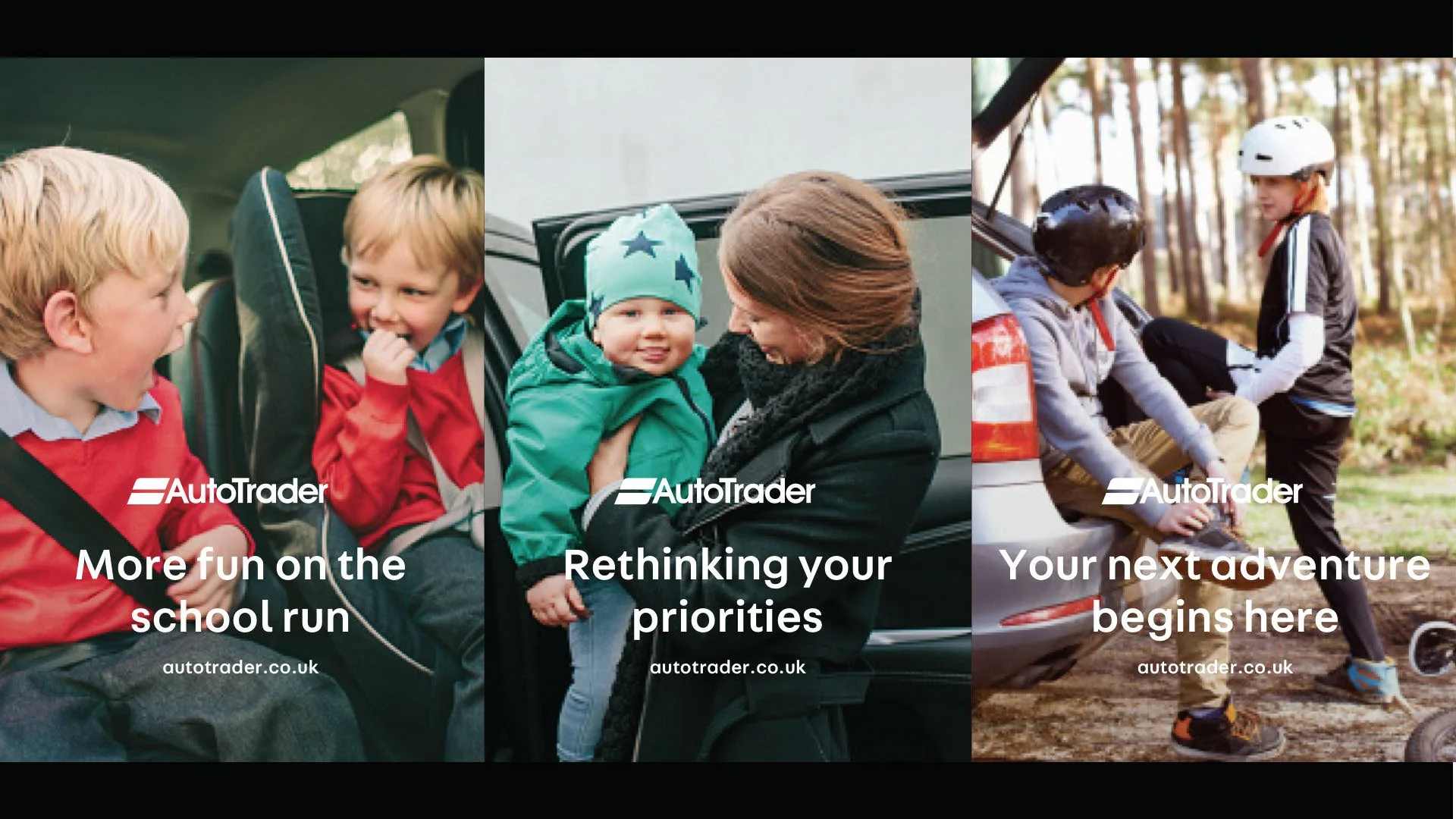
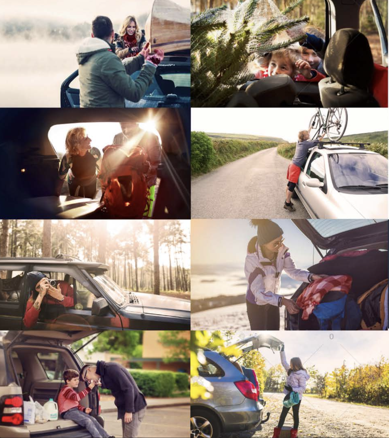
An angled graphic, inspired by the logo’s chevrons, helps frame content and imagery. Lifestyle photos add warmth and relatability, highlighting the everyday benefits of car ownership.
Illustration
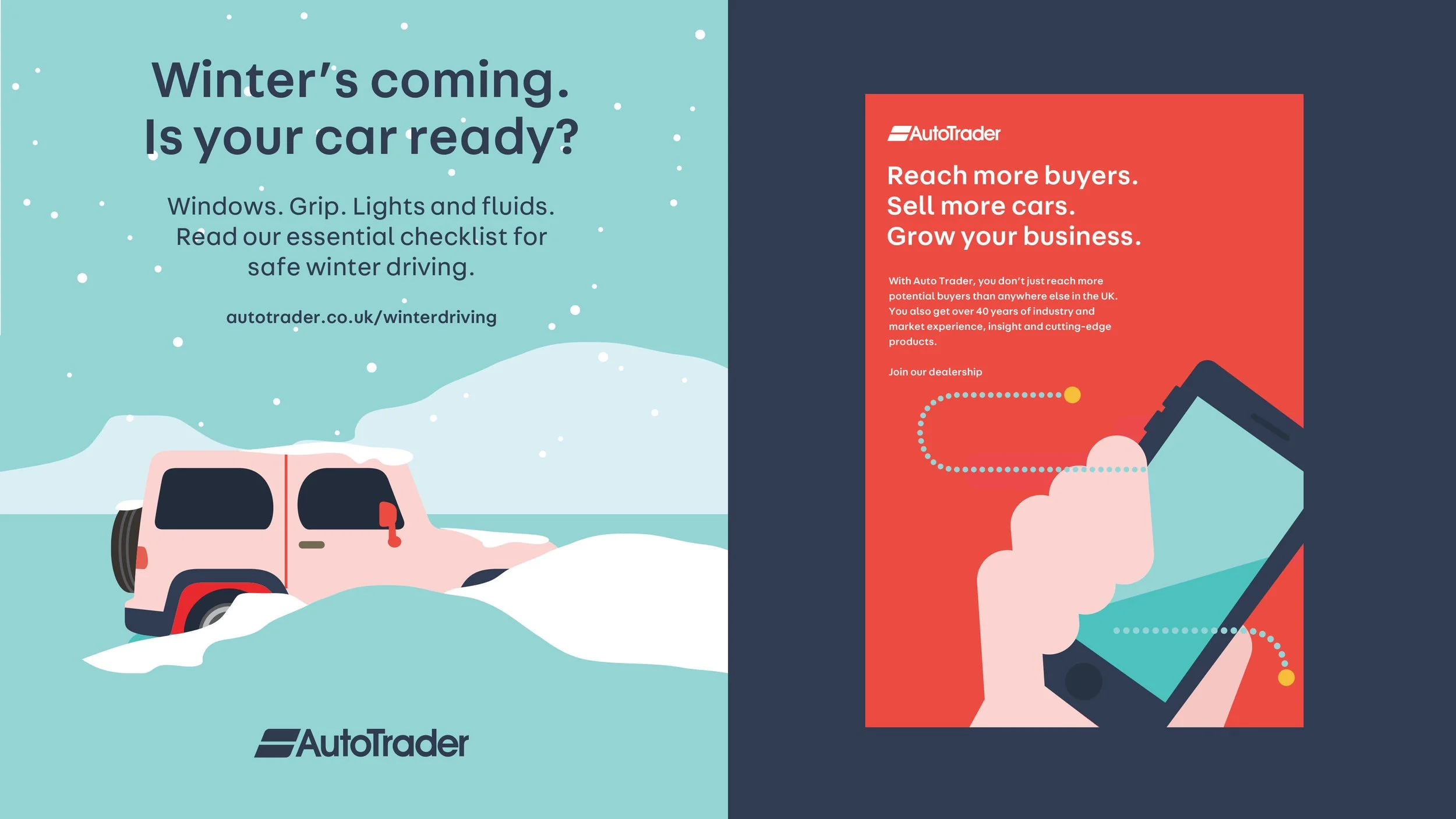
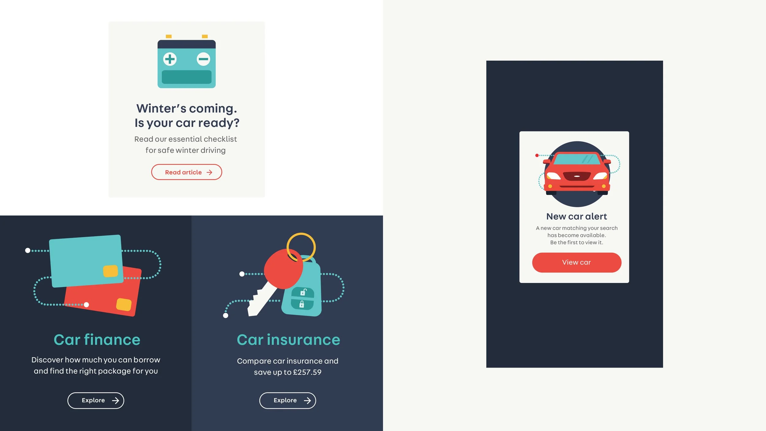
Illustrations provide the brand with ownable and friendly assets to quickly identify a topic or product. They build up from the Ul as a consistent style of flat graphic and bold elements.
Showreel & Motion UI
A showreel brings internal teams together by visually capturing the brand’s evolution and values. It drives alignment, inspires ownership, and reinforces the importance of consistency across the refreshed brand.
Print & Events
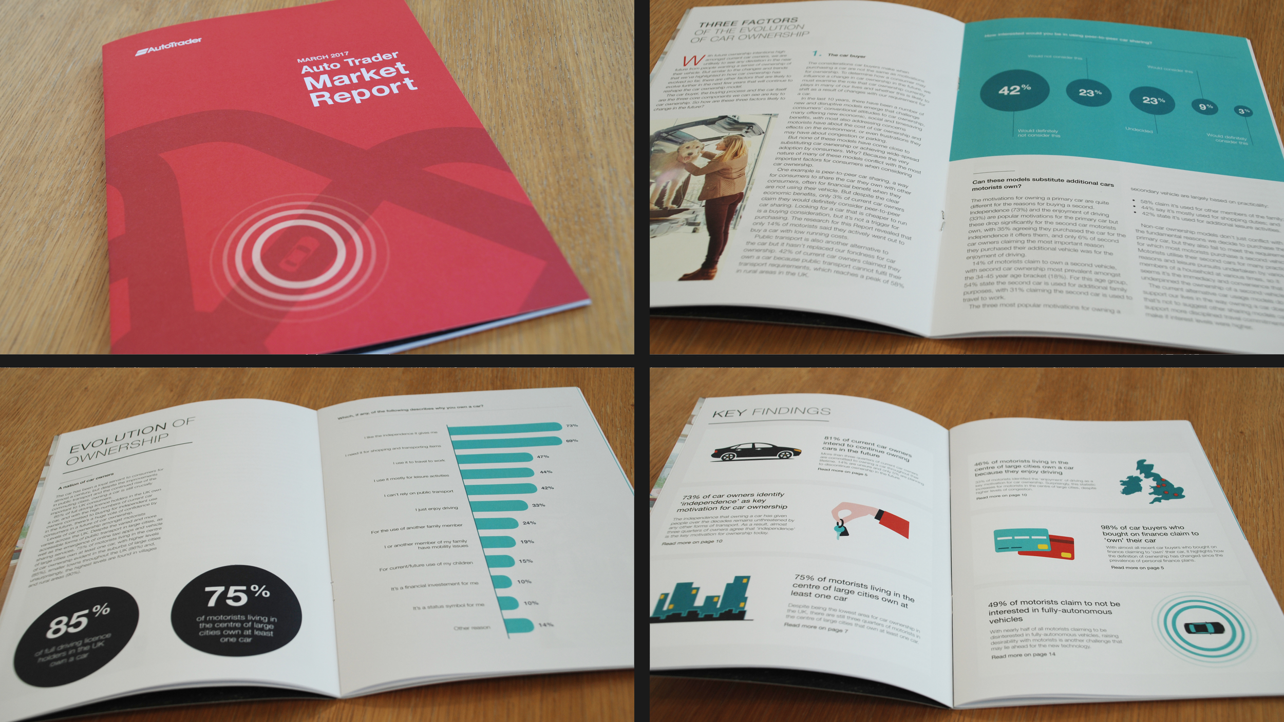
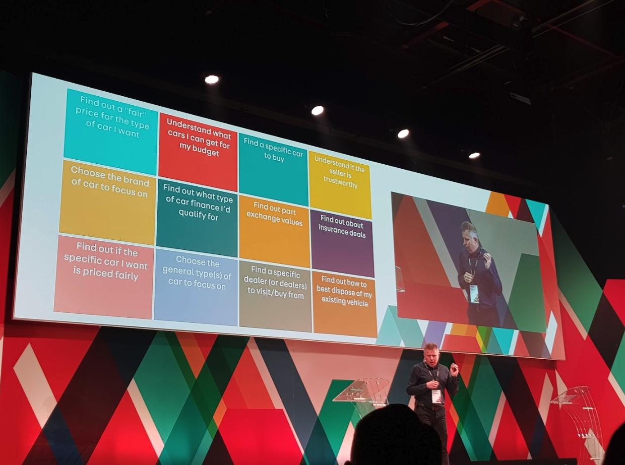
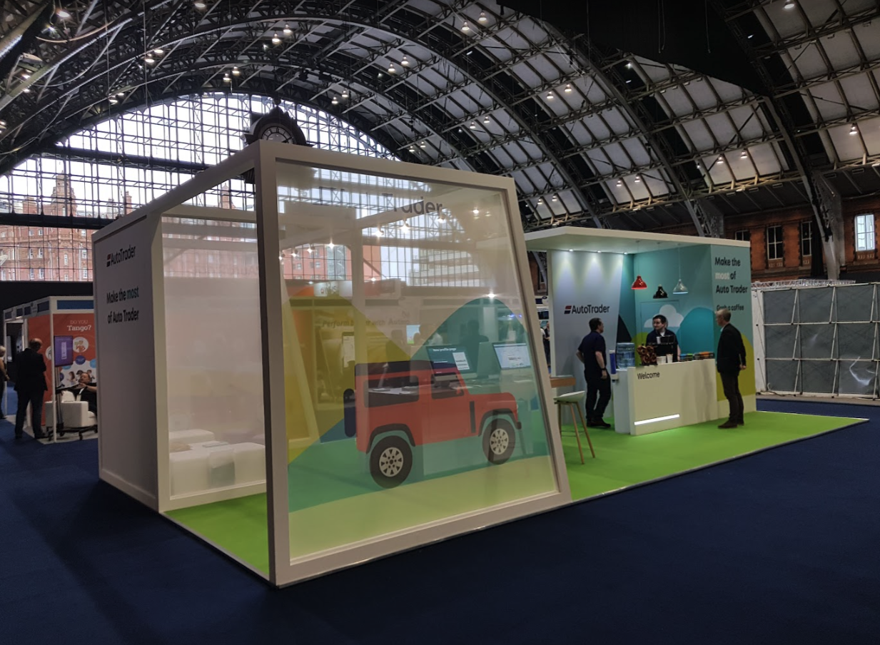
In a digital-first world, print and physical events give brands a tangible presence that screens can’t match. High-quality materials and real-time interactions create lasting, authentic connections—turning interest into trust and making the brand truly felt, not just seen.
£24 - Brand Hub
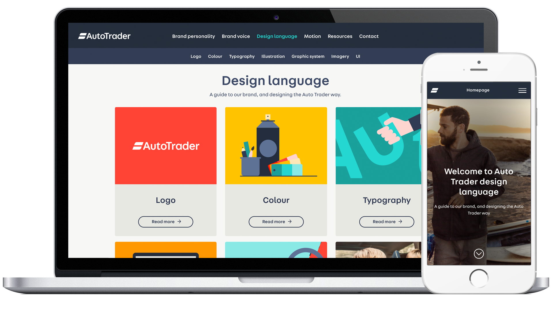
With internal resources stretched and an internal build estimated to take over 4 months, I turned to Squarespace to rapidly roll out the new brand and assets. It delivered a polished, fully branded experience—fast, consistent, and accessible without engineering support. It worked so well, they’re still using it today and all for £24 a month.
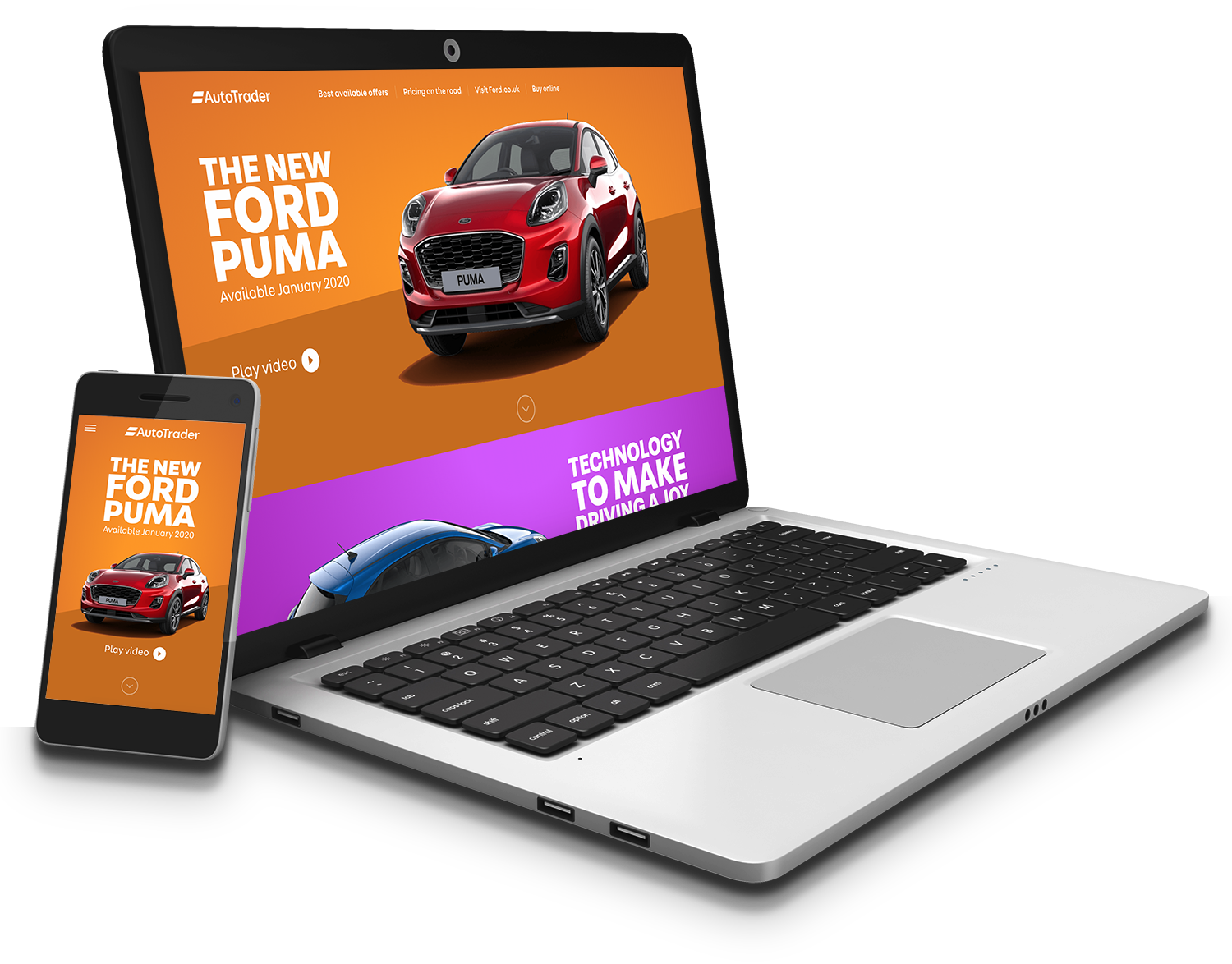
The cheeky customer
While you're here, read how two of us generated £3.5M in extra revenue and added 2.5M monthly visits to Auto Trader’s traffic from a single slack message, using nothing but Squarespace and our new, flexible design system. It's well worth readingIt's as It's repeatable in any business.
Click here - you might just be inspired to build your own success story.